Toggle navigation
My Account
0
Hotel Linen
Hotel Pillows
Hotel Bed Sheets
Hotel Sheets by Size
Top Sheets
Actil Commercial Bed Sheets
Jason Commercial
Actil First Line 100% Cotton
Logan & Mason 400TC Egyptian Cotton Bed Sheets
Alliance Bed Sheets
Bianca
Executive Hotel Bed Sheets
Dream Linen
Royal Doulton Cotton Bed Sheet Sets
Jason Commercial 100% Cotton Bed Sheets
Actil Superwash Ocean Trask
Sapphire Hotel Bed Sheets
Deluxe Commercial Hotel Bed Sheets
Logan & Mason 300TC Percale Cotton Bed Sheets
Logan & Mason 250TC Percale Polycotton Bed Sheet Sets
Santiago Charcoal Bed Sheet Sets
Santiago Steel Blue Bed Sheet Sets
Santiago Beige Stone Bed Sheet Sets
Pillow Cases
Private Collection - 500TC Cotton Sateen Bed Sheets
Mattress Protectors
Coolmax Waterproof Mattress Protector
Alliance Strapped Cotton Quilted Mattress Protector 100Gsm
Alliance Quilted Fitted Mattress Protector
Microloft Fitted Mattress Protectors 200Gsm
Eva Clean Waterproof Mattress Protectors
Alliance Coolbreeze Waterproof Mattress Protector
Bianca
Logan & Mason Cotton Mattress Protectors
Mattress Protectors by Size
Fibresmart Mattress Protectors
Hygiene Plus Mattress Protectors
Alliance Strapped Mattress Protectors
Quilt Covers
Quilt Covers By Size
Linx Polycotton Denim Quilt Covers
Linx Polycotton Sand
Ascot White Waffle Quilt Covers
Ascot Granite Waffle Quilt Covers
Ascot Pewter Waffle Quilt Covers
White Satin Stripe Quilt Cover Set 20mm
Brighton - Navy Quilt Cover Sets
Brighton - Charcoal Quilt Cover Sets
Essex Pewter Quilt Cover Sets
Essex Charcoal Quilt Cover Sets
Essex Beige Stone Quilt Cover Sets
Actil White Tailored Quilt Covers
Calista Quilt Cover Set - Indigo
Calista Quilt Cover Set - Granite
Calista Quilt Cover Set - Hazel
Actil Grenada Platinum
Clearance Quilt Covers
Jason White Tailored Quilt Covers
Ardor Leonardo Embossed - White
Villa Matelasse White Quilted Quilt Cover Sets
Studio Stripe Silver Grey Quilt Cover Sets
Studio Stripe Slate Charcoal Quilt Cover Sets
Studio Stripe Sage Green Quilt Cover Sets
White Satin Stripe Quilt Cover 20mm
Alliance Byron Ocean Quilt Covers
White Sateen Stripe Quilt Cover 10mm
Essex Olive Quilt Cover Sets
Ascot Surf Waffle Quilt Covers
Alliance Beige Oatmeal Quilt Covers
Villa Matelasse Slate Quilted Quilt Cover Sets
Santiago Charcoal Quilt Cover Sets
Santiago Steel Blue Quilt Cover Sets
Santiago Stone Beige Quilt Cover Sets
Bed Runners & Cushions
Parker Bed Runners & Cushions - Torquoise
Parker Bed Runners & Cushions - Ocean
Parker Bed Runners & Cushions - Russett
Parker Bed Runners & Cushions - Mocha
Regency Jacquard Bed Runners & Cushion - Champagne
Regency Jacquard Bed Runners & Cushion - Ink Blue
Regency Jacquard Bed Runners & Cushion – Ocean
Regency Jacquard Bed Runners & Cushion – Russet
Newington Bed Runners & Cushions - Charcoal
Newington Bed Runners & Cushions - Ashgrove Teal
Parker Bed Runners & Cushions Ink Blue / Black
Parker Bed Runners & Cushions - Charcoal
Cushion Inserts
Newington Bed Runners & Cushions - Ashgrove Sage
Newington Bed Runners & Cushions - Orange
Ashgrove Oak Bed Runners & Cushions
Linen Look Teal Bed Runners
Linen Look Marine Bed Runners
Linen Look Pewter Bed Runners
Linen Look Pebble Bed Runners
Blankets
Wool Blankets
Polar Fleece Blankets
Ultra Plush Blankets
Waffle Blankets
Lucia Plush Blankets
Ultra Fleece
Thermalux
Herringbone
Micro Fleece Blankets Super Soft
Mattress Toppers
Microloft Mattress Topper 400gsm
Simba Mattress Topper 800GSM
Luxury Mattress Topper
Microcloud Mattress Topper
Mattress Toppers by Size
1500gsm Ball Fibre Mattress Topper
Cumulus Mattress Topper 800gsm
Pillow Protectors
Electric Blankets
Quilt Protectors
Quilts
Hygiene + Plus Heavy Weight Quilts
Microloft All Season Quilts
Alliance Mid Weight Plush Quilts
Alliance Ultra Plush All Season Quilts
Fibresmart 350gsm Quilts
Heavenly Dreams Mid Weight Quilts
Jason Feather and Down Quilt 70/30
Jason Wool Quilt 500 GSM
Microloft Winter Weight Quilts
Microcloud
Ardor 300gsm Quilts
Quilts by Size
Alliance Classic Lightweight Quilts
Ardor Wool Quilts
microCloud Bedding
Decorator
European Pillowcases
Valances
Underlays
Coverlets & Comforters + Bedspreads
Kalia Bedspread Set White
Embroidered Vivid White Coverlet Sets
Embroidered Jade Coverlet Set
Windsor Coverlet Set
York Coverlet Sets
Hudson Stripe Comforter Navy
Villa Matelasse White Coverlet
Villa Matelasse Silver Coverlet
Villa Matelasse Slate Coverlet
Villa Matelasse Sage Coverlet
Antique White Coverlets
Pure White Coverlets
Essex Bedspreads
Ascot Waffle Coverlets
Byron Ocean Coverlets
Silk Pillowcases
Mattress Encasements Bed Bug Protection
Table Cloths & Napkins
Alliance Table Cloths & Serviettes
Simba Table Cloths & Serviettes
Guest Amenities
Classic Hair + Body Care Amenities
Kudos Spa
Eartherapy
Kudos Coastal
Eco Fresh
Savoir-Faire
Enriched
Pure Revere
Pure Beach
Basic Earth Botanicals
Executive Hair + Body Care
Sincerely Clean
Moments
Thankyou
Ideology
Vive [Re-Charge]
Soap Aid
Apotheke
Luxury Hair + Body Care
Bathe Hotel Guest Amenities
Sincerely Organics
Pacifics Pina Colada
Prija
Elemental Herbology
South Pacific Soap Company
Sodashi
Wallawa Botanical Indigenous Skincare Amenities
endota Spa
Urban Rituelle
Natural Earth
Geneva Green
Samples / Gift Packs
Soap Dispensers
Boxed & Sachet Accessories
Sewing Kits
Shave Kits
Shower Caps
Sanitary Bags
Dental Kits
Vanity Kits
Bath Salts
Shoe Shine
Combs
Makeup Remover Wipes
Bathroom Trays
Paper Products
Sun Screen
Laundry Bags & Sacks
Food & Beverage
Tea Sachets
Long Life Milk
Salt & Pepper
Beverage Packs
Individually Wrapped Biscuits
Sugar Sticks & Sachets
Sweetener Sticks & Sachets
Breakfast
Milo Sachets
Jams, Honey, Vegemite & Peanut Butter
Beerenberg
Spreads
Vegemite
Beerenberg Honey
Peanut Butter
Jams
Nutella
Sauces, Pastes & Chutneys
Mustards
Hot Chocolate Sachets
Coffee Sachets & Sticks
Paper Cups & Stirrers
Mints
Hotel Towels
Pool Towels
Actil Super Deluxe Bath Towels
5 Star Towelling
Tea Towels
Actil Down Under Bath Towels
Actil Down Under Charcoal Grey Bath Towels
Actil Down Under Linen Beige Bath Towels
Actil Down Under Royal Blue Bath Towels
Actil Down Under Alpine Green Bath Towels
Actil Down Under White Bath Towels
Actil Down Under Forest Green Bath Towels
Alliance White Bath Towels
Elite Commercial Towels
Elite Extra Large Spa Towels
Elite Bath Sheets
Elite Bath Towels
Elite Facewashers
Elite Bath Mats
Elite Hand Towels
Alliance Ultra Bath Towels 625gsm
Alliance Ultra Frost Green Bath Towels (625gsm)
Alliance Ultra Linen Beige Bath Towels 625gsm
Alliance Ultra Charcoal Grey Bath Towels 625gsm
Alliance Ultra Driftwood Brown Bath Towels 625GSM
Alliance Ultra White Bath Towels 625gsm
Algodon St Regis Bath Towels
Royal Doulton Organic Towels
Deluxe 650gsm Commercial Bath Towels
Logan & Mason Commercial Bath Towels
Coloured Vat Dyed Towels
Sale
Reduced to Clear
Weekly Specials
New Arrival Promotions
Housekeeping
Portioned Detergents
Laundry
Kitchen
Toilet Paper & Facial Tissues
Toilet Paper
Facial Tissues
Hand Paper Towel
Bin Liners
Housekeeping Trolley
Cleaning
Urine & Stain Remover
Surface & Fabric Sanitiser
Hand Sanitiser
Bin Liners & Bags
Cleaning Cloths
Dishwashing Accessories
Dish Drainers
Paper Towel Dispensers
Cleaning Cloths
Gloves
Toilet Seat Seals
MiniBar Carts
Maids Carts
Food Carts
Deodorisers
Laundry Trolley
Hotel Accessories
Slippers
Tissue Box Cover
Luggage Rack
Ironing Boards
Ironing Boards
Ironing Board Covers
Ironing Board Organisers
Coat Hangers
Registry
Compass Coat Hangers
Hotel Bathrobe
Decor
Decor Signs
Vases
Wall Art
Bins
Ashtrays
Pedal Bins
Waste Bins
Bellboy & Luggage Trolleys
Tea Boxes & Sachet Holders
Signs
Storage Bags
Hair Dryer Bags
Pillow Bags
Newspaper Bags
Blanket Storage Bags
Laundry Bags
Laundry Storage
Safes
Front Desk
Games
Door Mats
Emergency Torches Auto On
Bathroom Accessories
Soap Dishes
Bathroom Boxes & Canisters
Toothbrush Holders
Bathroom Makeup Mirrors
Bathroom Tray
Retractable Wall Mounted Clotheslines
Toilet Brushes
Shower Curtains
Long Single Sheets Plus More
Long Single Mattress Topper
Long Single Sheets Cotton / Poly Blend
Long Single Mattress Protectors
Long Single Sheets 100% Cotton
Sheet Sets
Separates
Long Single Valances
Kitchenware Cafe
Kitchen Essentials
Trays & Sachet Holders
Tea & Coffee Caddies
Serving Trays
Miscellaneous Trays
Display Stands
Knives & Knife Racks
Table Top & Bar
Glassware
Cutlery
Crockery
Melamine & Polycarbonate
Tea Pots
Salt & Pepper Mills
Buffet & Serving
Cups & Mugs
Barware
Coffee Pots & Plungers
Placemats
Back of House
Cooking Utensils
Cookware
Shakers
Gastronorm & Insert Pans
Cafe Accessories
Electrical
Kettles
Hair Dryers
Irons
Toasters
Fridges
Compressor
Wall Mounted Emergency Torches
Sandwich Presses
Microwaves
Heaters
Bulk Soap & Haircare
Hand & Body Wash Soap Dispensers
Soap Bars
Classic Soap Bars
Executive Soap Bars
Luxury Soap Bars
Shampoo & Conditioner Dispensers
Hand & Body Wash Refills
Hair Care Refills
Body Lotion Dispensers
Body Lotion Refills
Bathrobes & Slippers
Products
About Us
Contact Us
Blog
(03) 8638 0115
My Account
Account Home
Orders
Quotes
Pay Invoices
Favourites
Wishlists
Resolution Centre
Edit My Details
Edit My Address Book
Cart
0
Bathrobes & Slippers
Bathroom Accessories
Bathroom Boxes & Canisters
Bathroom Makeup Mirrors
Bathroom Tray
Retractable Wall Mounted Clotheslines
Shower Curtains
Soap Dishes
Toilet Brushes
Toothbrush Holders
Bulk Soap & Haircare
Body Lotion Dispensers
Body Lotion Refills
Hair Care Refills
Hand & Body Wash Refills
Hand & Body Wash Soap Dispensers
Shampoo & Conditioner Dispensers
Soap Bars
Classic Soap Bars
Executive Soap Bars
Luxury Soap Bars
Electrical
Fridges
Compressor
Hair Dryers
Heaters
Irons
Kettles
Microwaves
Sandwich Presses
Toasters
Wall Mounted Emergency Torches
Food & Beverage
Beverage Packs
Breakfast
Coffee Sachets & Sticks
Hot Chocolate Sachets
Individually Wrapped Biscuits
Jams, Honey, Vegemite & Peanut Butter
Beerenberg
Beerenberg Honey
Jams
Nutella
Peanut Butter
Spreads
Vegemite
Long Life Milk
Milo Sachets
Mints
Mustards
Paper Cups & Stirrers
Salt & Pepper
Sauces, Pastes & Chutneys
Sugar Sticks & Sachets
Sweetener Sticks & Sachets
Tea Sachets
Guest Amenities
Bathroom Trays
Boxed & Sachet Accessories
Bath Salts
Combs
Dental Kits
Makeup Remover Wipes
Sanitary Bags
Sewing Kits
Shave Kits
Shoe Shine
Shower Caps
Vanity Kits
Classic Hair + Body Care Amenities
Basic Earth Botanicals
Eartherapy
Eco Fresh
Enriched
Kudos Coastal
Kudos Spa
Pure Beach
Pure Revere
Savoir-Faire
Executive Hair + Body Care
Apotheke
Ideology
Moments
Sincerely Clean
Soap Aid
Thankyou
Vive [Re-Charge]
Luxury Hair + Body Care
Bathe Hotel Guest Amenities
Elemental Herbology
endota Spa
Geneva Green
Natural Earth
Pacifics Pina Colada
Prija
Sincerely Organics
Sodashi
South Pacific Soap Company
Urban Rituelle
Wallawa Botanical Indigenous Skincare Amenities
Paper Products
Samples / Gift Packs
Soap Dispensers
Sun Screen
Hotel Accessories
Bellboy & Luggage Trolleys
Bins
Ashtrays
Pedal Bins
Waste Bins
Coat Hangers
Compass Coat Hangers
Registry
Decor
Decor Signs
Vases
Wall Art
Door Mats
Emergency Torches Auto On
Front Desk
Games
Hotel Bathrobe
Ironing Boards
Ironing Board Covers
Ironing Board Organisers
Ironing Boards
Luggage Rack
Safes
Signs
Slippers
Storage Bags
Blanket Storage Bags
Hair Dryer Bags
Laundry Bags
Laundry Storage
Newspaper Bags
Pillow Bags
Tea Boxes & Sachet Holders
Tissue Box Cover
Hotel Linen
Bed Runners & Cushions
Ashgrove Oak Bed Runners & Cushions
Cushion Inserts
Linen Look Marine Bed Runners
Linen Look Pebble Bed Runners
Linen Look Pewter Bed Runners
Linen Look Teal Bed Runners
Newington Bed Runners & Cushions - Ashgrove Sage
Newington Bed Runners & Cushions - Ashgrove Teal
Newington Bed Runners & Cushions - Charcoal
Newington Bed Runners & Cushions - Orange
Parker Bed Runners & Cushions - Charcoal
Parker Bed Runners & Cushions - Mocha
Parker Bed Runners & Cushions - Ocean
Parker Bed Runners & Cushions - Russett
Parker Bed Runners & Cushions - Torquoise
Parker Bed Runners & Cushions Ink Blue / Black
Regency Jacquard Bed Runners & Cushion - Champagne
Regency Jacquard Bed Runners & Cushion - Ink Blue
Regency Jacquard Bed Runners & Cushion – Ocean
Regency Jacquard Bed Runners & Cushion – Russet
Blankets
Herringbone
Lucia Plush Blankets
Micro Fleece Blankets Super Soft
Polar Fleece Blankets
Thermalux
Ultra Fleece
Ultra Plush Blankets
Waffle Blankets
Wool Blankets
Coverlets & Comforters + Bedspreads
Antique White Coverlets
Ascot Waffle Coverlets
Byron Ocean Coverlets
Embroidered Jade Coverlet Set
Embroidered Vivid White Coverlet Sets
Essex Bedspreads
Hudson Stripe Comforter Navy
Kalia Bedspread Set White
Pure White Coverlets
Villa Matelasse Sage Coverlet
Villa Matelasse Silver Coverlet
Villa Matelasse Slate Coverlet
Villa Matelasse White Coverlet
Windsor Coverlet Set
York Coverlet Sets
Decorator
Electric Blankets
European Pillowcases
Hotel Bed Sheets
Actil Commercial Bed Sheets
Actil First Line 100% Cotton
Actil Superwash Ocean Trask
Alliance Bed Sheets
Bianca
Deluxe Commercial Hotel Bed Sheets
Dream Linen
Executive Hotel Bed Sheets
Hotel Sheets by Size
Jason Commercial
Jason Commercial 100% Cotton Bed Sheets
Logan & Mason 250TC Percale Polycotton Bed Sheet Sets
Logan & Mason 300TC Percale Cotton Bed Sheets
Logan & Mason 400TC Egyptian Cotton Bed Sheets
Pillow Cases
Private Collection - 500TC Cotton Sateen Bed Sheets
Royal Doulton Cotton Bed Sheet Sets
Santiago Beige Stone Bed Sheet Sets
Santiago Charcoal Bed Sheet Sets
Santiago Steel Blue Bed Sheet Sets
Sapphire Hotel Bed Sheets
Top Sheets
Hotel Pillows
Mattress Encasements Bed Bug Protection
Mattress Protectors
Alliance Coolbreeze Waterproof Mattress Protector
Alliance Quilted Fitted Mattress Protector
Alliance Strapped Cotton Quilted Mattress Protector 100Gsm
Alliance Strapped Mattress Protectors
Bianca
Coolmax Waterproof Mattress Protector
Eva Clean Waterproof Mattress Protectors
Fibresmart Mattress Protectors
Hygiene Plus Mattress Protectors
Logan & Mason Cotton Mattress Protectors
Mattress Protectors by Size
Microloft Fitted Mattress Protectors 200Gsm
Mattress Toppers
1500gsm Ball Fibre Mattress Topper
Cumulus Mattress Topper 800gsm
Luxury Mattress Topper
Mattress Toppers by Size
Microcloud Mattress Topper
Microloft Mattress Topper 400gsm
Simba Mattress Topper 800GSM
microCloud Bedding
Pillow Protectors
Quilt Covers
Actil Grenada Platinum
Actil White Tailored Quilt Covers
Alliance Beige Oatmeal Quilt Covers
Alliance Byron Ocean Quilt Covers
Ardor Leonardo Embossed - White
Ascot Granite Waffle Quilt Covers
Ascot Pewter Waffle Quilt Covers
Ascot Surf Waffle Quilt Covers
Ascot White Waffle Quilt Covers
Brighton - Charcoal Quilt Cover Sets
Brighton - Navy Quilt Cover Sets
Calista Quilt Cover Set - Granite
Calista Quilt Cover Set - Hazel
Calista Quilt Cover Set - Indigo
Clearance Quilt Covers
Essex Beige Stone Quilt Cover Sets
Essex Charcoal Quilt Cover Sets
Essex Olive Quilt Cover Sets
Essex Pewter Quilt Cover Sets
Jason White Tailored Quilt Covers
Linx Polycotton Denim Quilt Covers
Linx Polycotton Sand
Quilt Covers By Size
Santiago Charcoal Quilt Cover Sets
Santiago Steel Blue Quilt Cover Sets
Santiago Stone Beige Quilt Cover Sets
Studio Stripe Sage Green Quilt Cover Sets
Studio Stripe Silver Grey Quilt Cover Sets
Studio Stripe Slate Charcoal Quilt Cover Sets
Villa Matelasse Slate Quilted Quilt Cover Sets
Villa Matelasse White Quilted Quilt Cover Sets
White Sateen Stripe Quilt Cover 10mm
White Satin Stripe Quilt Cover 20mm
White Satin Stripe Quilt Cover Set 20mm
Quilt Protectors
Quilts
Alliance Classic Lightweight Quilts
Alliance Mid Weight Plush Quilts
Alliance Ultra Plush All Season Quilts
Ardor 300gsm Quilts
Ardor Wool Quilts
Fibresmart 350gsm Quilts
Heavenly Dreams Mid Weight Quilts
Hygiene + Plus Heavy Weight Quilts
Jason Feather and Down Quilt 70/30
Jason Wool Quilt 500 GSM
Microcloud
Microloft All Season Quilts
Microloft Winter Weight Quilts
Quilts by Size
Silk Pillowcases
Table Cloths & Napkins
Alliance Table Cloths & Serviettes
Simba Table Cloths & Serviettes
Underlays
Valances
Hotel Towels
5 Star Towelling
Actil Down Under Bath Towels
Actil Down Under Alpine Green Bath Towels
Actil Down Under Charcoal Grey Bath Towels
Actil Down Under Forest Green Bath Towels
Actil Down Under Linen Beige Bath Towels
Actil Down Under Royal Blue Bath Towels
Actil Down Under White Bath Towels
Actil Super Deluxe Bath Towels
Algodon St Regis Bath Towels
Alliance Ultra Bath Towels 625gsm
Alliance Ultra Charcoal Grey Bath Towels 625gsm
Alliance Ultra Driftwood Brown Bath Towels 625GSM
Alliance Ultra Frost Green Bath Towels (625gsm)
Alliance Ultra Linen Beige Bath Towels 625gsm
Alliance Ultra White Bath Towels 625gsm
Alliance White Bath Towels
Coloured Vat Dyed Towels
Deluxe 650gsm Commercial Bath Towels
Elite Commercial Towels
Elite Bath Mats
Elite Bath Sheets
Elite Bath Towels
Elite Extra Large Spa Towels
Elite Facewashers
Elite Hand Towels
Logan & Mason Commercial Bath Towels
Pool Towels
Royal Doulton Organic Towels
Tea Towels
Housekeeping
Bin Liners
Cleaning
Bin Liners & Bags
Cleaning Cloths
Dish Drainers
Dishwashing Accessories
Hand Sanitiser
Surface & Fabric Sanitiser
Urine & Stain Remover
Cleaning Cloths
Deodorisers
Food Carts
Gloves
Housekeeping Trolley
Laundry Trolley
Maids Carts
MiniBar Carts
Paper Towel Dispensers
Portioned Detergents
Kitchen
Laundry
Toilet Paper & Facial Tissues
Facial Tissues
Hand Paper Towel
Toilet Paper
Toilet Seat Seals
Kitchenware Cafe
Back of House
Cooking Utensils
Cookware
Gastronorm & Insert Pans
Shakers
Cafe Accessories
Display Stands
Kitchen Essentials
Knives & Knife Racks
Table Top & Bar
Glassware
Barware
Buffet & Serving
Coffee Pots & Plungers
Crockery
Cups & Mugs
Cutlery
Melamine & Polycarbonate
Placemats
Salt & Pepper Mills
Tea Pots
Trays & Sachet Holders
Miscellaneous Trays
Serving Trays
Tea & Coffee Caddies
Laundry Bags & Sacks
Long Single Sheets Plus More
Long Single Mattress Protectors
Long Single Mattress Topper
Long Single Sheets 100% Cotton
Separates
Sheet Sets
Long Single Sheets Cotton / Poly Blend
Long Single Valances
Sale
New Arrival Promotions
Reduced to Clear
Weekly Specials
Categories
Hotel Linen
Hotel Pillows
Bed Runners & Cushions
Ashgrove Oak Bed Runners & Cushions
Cushion Inserts
Linen Look Marine Bed Runners
Linen Look Pebble Bed Runners
Linen Look Pewter Bed Runners
Linen Look Teal Bed Runners
Newington Bed Runners & Cushions - Ashgrove Sage
Newington Bed Runners & Cushions - Ashgrove Teal
Newington Bed Runners & Cushions - Charcoal
Newington Bed Runners & Cushions - Orange
Parker Bed Runners & Cushions - Charcoal
Parker Bed Runners & Cushions - Mocha
Parker Bed Runners & Cushions - Ocean
Parker Bed Runners & Cushions - Russett
Parker Bed Runners & Cushions - Torquoise
Parker Bed Runners & Cushions Ink Blue / Black
Regency Jacquard Bed Runners & Cushion - Champagne
Regency Jacquard Bed Runners & Cushion - Ink Blue
Regency Jacquard Bed Runners & Cushion – Ocean
Regency Jacquard Bed Runners & Cushion – Russet
Blankets
Herringbone
Lucia Plush Blankets
Micro Fleece Blankets Super Soft
Polar Fleece Blankets
Thermalux
Ultra Fleece
Ultra Plush Blankets
Waffle Blankets
Wool Blankets
Coverlets & Comforters + Bedspreads
Antique White Coverlets
Ascot Waffle Coverlets
Byron Ocean Coverlets
Embroidered Jade Coverlet Set
Embroidered Vivid White Coverlet Sets
Essex Bedspreads
Hudson Stripe Comforter Navy
Kalia Bedspread Set White
Pure White Coverlets
Villa Matelasse Sage Coverlet
Villa Matelasse Silver Coverlet
Villa Matelasse Slate Coverlet
Villa Matelasse White Coverlet
Windsor Coverlet Set
York Coverlet Sets
Decorator
Electric Blankets
European Pillowcases
Hotel Bed Sheets
Hotel Sheets by Size
Actil Commercial Bed Sheets
Actil First Line 100% Cotton
Actil Superwash Ocean Trask
Alliance Bed Sheets
Bianca
Deluxe Commercial Hotel Bed Sheets
Dream Linen
Executive Hotel Bed Sheets
Jason Commercial
Jason Commercial 100% Cotton Bed Sheets
Logan & Mason 250TC Percale Polycotton Bed Sheet Sets
Logan & Mason 300TC Percale Cotton Bed Sheets
Logan & Mason 400TC Egyptian Cotton Bed Sheets
Pillow Cases
Private Collection - 500TC Cotton Sateen Bed Sheets
Royal Doulton Cotton Bed Sheet Sets
Santiago Beige Stone Bed Sheet Sets
Santiago Charcoal Bed Sheet Sets
Santiago Steel Blue Bed Sheet Sets
Sapphire Hotel Bed Sheets
Top Sheets
Mattress Encasements Bed Bug Protection
Mattress Protectors
Alliance Coolbreeze Waterproof Mattress Protector
Alliance Quilted Fitted Mattress Protector
Alliance Strapped Cotton Quilted Mattress Protector 100Gsm
Alliance Strapped Mattress Protectors
Bianca
Coolmax Waterproof Mattress Protector
Eva Clean Waterproof Mattress Protectors
Fibresmart Mattress Protectors
Hygiene Plus Mattress Protectors
Logan & Mason Cotton Mattress Protectors
Mattress Protectors by Size
Microloft Fitted Mattress Protectors 200Gsm
Mattress Toppers
1500gsm Ball Fibre Mattress Topper
Cumulus Mattress Topper 800gsm
Luxury Mattress Topper
Mattress Toppers by Size
Microcloud Mattress Topper
Microloft Mattress Topper 400gsm
Simba Mattress Topper 800GSM
microCloud Bedding
Pillow Protectors
Quilt Covers
Quilt Covers By Size
Actil Grenada Platinum
Actil White Tailored Quilt Covers
Alliance Beige Oatmeal Quilt Covers
Alliance Byron Ocean Quilt Covers
Ardor Leonardo Embossed - White
Ascot Granite Waffle Quilt Covers
Ascot Pewter Waffle Quilt Covers
Ascot Surf Waffle Quilt Covers
Ascot White Waffle Quilt Covers
Brighton - Charcoal Quilt Cover Sets
Brighton - Navy Quilt Cover Sets
Calista Quilt Cover Set - Granite
Calista Quilt Cover Set - Hazel
Calista Quilt Cover Set - Indigo
Clearance Quilt Covers
Essex Beige Stone Quilt Cover Sets
Essex Charcoal Quilt Cover Sets
Essex Olive Quilt Cover Sets
Essex Pewter Quilt Cover Sets
Jason White Tailored Quilt Covers
Linx Polycotton Denim Quilt Covers
Linx Polycotton Sand
Santiago Charcoal Quilt Cover Sets
Santiago Steel Blue Quilt Cover Sets
Santiago Stone Beige Quilt Cover Sets
Studio Stripe Sage Green Quilt Cover Sets
Studio Stripe Silver Grey Quilt Cover Sets
Studio Stripe Slate Charcoal Quilt Cover Sets
Villa Matelasse Slate Quilted Quilt Cover Sets
Villa Matelasse White Quilted Quilt Cover Sets
White Sateen Stripe Quilt Cover 10mm
White Satin Stripe Quilt Cover 20mm
White Satin Stripe Quilt Cover Set 20mm
Quilt Protectors
Quilts
Alliance Classic Lightweight Quilts
Alliance Mid Weight Plush Quilts
Alliance Ultra Plush All Season Quilts
Ardor 300gsm Quilts
Ardor Wool Quilts
Fibresmart 350gsm Quilts
Heavenly Dreams Mid Weight Quilts
Hygiene + Plus Heavy Weight Quilts
Jason Feather and Down Quilt 70/30
Jason Wool Quilt 500 GSM
Microcloud
Microloft All Season Quilts
Microloft Winter Weight Quilts
Quilts by Size
Silk Pillowcases
Table Cloths & Napkins
Alliance Table Cloths & Serviettes
Simba Table Cloths & Serviettes
Underlays
Valances
Guest Amenities
Classic Hair + Body Care Amenities
Kudos Spa
Eartherapy
Kudos Coastal
Eco Fresh
Savoir-Faire
Enriched
Pure Revere
Pure Beach
Basic Earth Botanicals
Executive Hair + Body Care
Sincerely Clean
Moments
Thankyou
Ideology
Vive [Re-Charge]
Soap Aid
Apotheke
Luxury Hair + Body Care
Bathe Hotel Guest Amenities
Sincerely Organics
Pacifics Pina Colada
Prija
Elemental Herbology
South Pacific Soap Company
Sodashi
Wallawa Botanical Indigenous Skincare Amenities
endota Spa
Urban Rituelle
Natural Earth
Geneva Green
Samples / Gift Packs
Bathroom Trays
Boxed & Sachet Accessories
Bath Salts
Combs
Dental Kits
Makeup Remover Wipes
Sanitary Bags
Sewing Kits
Shave Kits
Shoe Shine
Shower Caps
Vanity Kits
Paper Products
Soap Dispensers
Sun Screen
Laundry Bags & Sacks
Food & Beverage
Tea Sachets
Beverage Packs
Breakfast
Coffee Sachets & Sticks
Hot Chocolate Sachets
Individually Wrapped Biscuits
Jams, Honey, Vegemite & Peanut Butter
Beerenberg
Beerenberg Honey
Jams
Nutella
Peanut Butter
Spreads
Vegemite
Long Life Milk
Milo Sachets
Mints
Mustards
Paper Cups & Stirrers
Salt & Pepper
Sauces, Pastes & Chutneys
Sugar Sticks & Sachets
Sweetener Sticks & Sachets
Hotel Towels
5 Star Towelling
Actil Down Under Bath Towels
Actil Down Under Alpine Green Bath Towels
Actil Down Under Charcoal Grey Bath Towels
Actil Down Under Forest Green Bath Towels
Actil Down Under Linen Beige Bath Towels
Actil Down Under Royal Blue Bath Towels
Actil Down Under White Bath Towels
Actil Super Deluxe Bath Towels
Algodon St Regis Bath Towels
Alliance Ultra Bath Towels 625gsm
Alliance Ultra Charcoal Grey Bath Towels 625gsm
Alliance Ultra Driftwood Brown Bath Towels 625GSM
Alliance Ultra Frost Green Bath Towels (625gsm)
Alliance Ultra Linen Beige Bath Towels 625gsm
Alliance Ultra White Bath Towels 625gsm
Alliance White Bath Towels
Coloured Vat Dyed Towels
Deluxe 650gsm Commercial Bath Towels
Elite Commercial Towels
Elite Bath Mats
Elite Bath Sheets
Elite Bath Towels
Elite Extra Large Spa Towels
Elite Facewashers
Elite Hand Towels
Logan & Mason Commercial Bath Towels
Pool Towels
Royal Doulton Organic Towels
Tea Towels
Sale
New Arrival Promotions
Reduced to Clear
Weekly Specials
Bathrobes & Slippers
Bathroom Accessories
Bathroom Boxes & Canisters
Bathroom Makeup Mirrors
Bathroom Tray
Retractable Wall Mounted Clotheslines
Shower Curtains
Soap Dishes
Toilet Brushes
Toothbrush Holders
Bulk Soap & Haircare
Body Lotion Dispensers
Body Lotion Refills
Hair Care Refills
Hand & Body Wash Refills
Hand & Body Wash Soap Dispensers
Shampoo & Conditioner Dispensers
Soap Bars
Classic Soap Bars
Executive Soap Bars
Luxury Soap Bars
Electrical
Fridges
Compressor
Hair Dryers
Heaters
Irons
Kettles
Microwaves
Sandwich Presses
Toasters
Wall Mounted Emergency Torches
Hotel Accessories
Slippers
Tissue Box Cover
Bellboy & Luggage Trolleys
Bins
Ashtrays
Pedal Bins
Waste Bins
Coat Hangers
Compass Coat Hangers
Registry
Decor
Decor Signs
Vases
Wall Art
Door Mats
Emergency Torches Auto On
Front Desk
Games
Hotel Bathrobe
Ironing Boards
Ironing Board Covers
Ironing Board Organisers
Ironing Boards
Luggage Rack
Safes
Signs
Storage Bags
Blanket Storage Bags
Hair Dryer Bags
Laundry Bags
Laundry Storage
Newspaper Bags
Pillow Bags
Tea Boxes & Sachet Holders
Housekeeping
Bin Liners
Cleaning
Bin Liners & Bags
Cleaning Cloths
Dish Drainers
Dishwashing Accessories
Hand Sanitiser
Surface & Fabric Sanitiser
Urine & Stain Remover
Cleaning Cloths
Deodorisers
Food Carts
Gloves
Housekeeping Trolley
Laundry Trolley
Maids Carts
MiniBar Carts
Paper Towel Dispensers
Portioned Detergents
Kitchen
Laundry
Toilet Paper & Facial Tissues
Facial Tissues
Hand Paper Towel
Toilet Paper
Toilet Seat Seals
Kitchenware Cafe
Kitchen Essentials
Back of House
Cooking Utensils
Cookware
Gastronorm & Insert Pans
Shakers
Cafe Accessories
Display Stands
Knives & Knife Racks
Table Top & Bar
Glassware
Barware
Buffet & Serving
Coffee Pots & Plungers
Crockery
Cups & Mugs
Cutlery
Melamine & Polycarbonate
Placemats
Salt & Pepper Mills
Tea Pots
Trays & Sachet Holders
Miscellaneous Trays
Serving Trays
Tea & Coffee Caddies
Long Single Sheets Plus More
Long Single Mattress Topper
Long Single Sheets Cotton / Poly Blend
Long Single Mattress Protectors
Long Single Sheets 100% Cotton
Separates
Sheet Sets
Long Single Valances
Information
About Us
Returns Policy
Contact Us
Home
Toys & Games
Games
Games
Card Games
Share:
Facebook
Twitter
Pinterest
Google+
...
Read More
1
Games Room 80s Pop Culture Trivia
$AUD19.00
Add to Cart
Games Room After Dinner Quiz Compendium Game
$AUD31.00
Add to Cart
Games Room Animal Lovers Trivia
$AUD9.00
Add to Cart
Games Room Art Trivia
$AUD19.00
Add to Cart
Games Room Beer Trivia Multi-Coloured
$AUD19.00
Add to Cart
Games Room Bizarre Facts Quiz
$AUD21.00
Add to Cart
Games Room Brain Freeze Quiz
$AUD19.00
Add to Cart
Games Room Car Buff Trivia New Version Multi-Colou
$AUD19.00
Add to Cart
Games Room Celebrity Trivia Quiz
$AUD19.00
VIEW ITEM
Games Room Classic Charades
$AUD18.00
Backorder
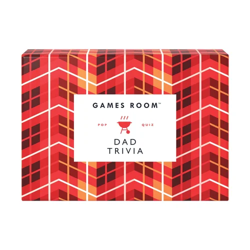
Games Room Dad Trivia Trivia
$AUD21.00
Backorder
Games Room Ding It!
$AUD29.00
Add to Cart
Games Room Family Fun Trivia
$AUD19.00
Backorder
Games Room Food & Drink Quiz
$AUD19.00
Add to Cart
Games Room General Knowledge Quiz
$AUD18.00
Add to Cart
Games Room Have You Ever?
$AUD24.00
Add to Cart
Games Room Literary Trivia
$AUD19.00
Add to Cart
Games Room Movie Buff Trivia
$AUD20.00
Backorder
Games Room This or That Party Game
$AUD18.00
Add to Cart
Games Room Travel Quiz
$AUD18.00
Add to Cart
Games Room True Crime Trivia Red
$AUD19.00
Add to Cart
Games Room TV Show Quiz
$AUD19.00
Add to Cart
Games Room What Am I? Guessing Game Multi-Coloured
$AUD19.00
Add to Cart
Games Room What Movie Am I?
$AUD19.00
Backorder
Games Room Where am I? Guessing Game
$AUD19.00
Add to Cart
Games Room Who Am I Quiz
$AUD19.00
Add to Cart
Games Room Wine Trivia
$AUD21.00
Add to Cart
Ridleys Drawsome People Party Game
$AUD35.00
Add to Cart
1